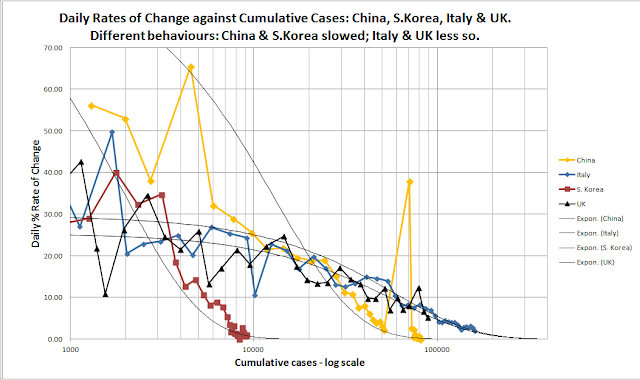
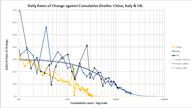
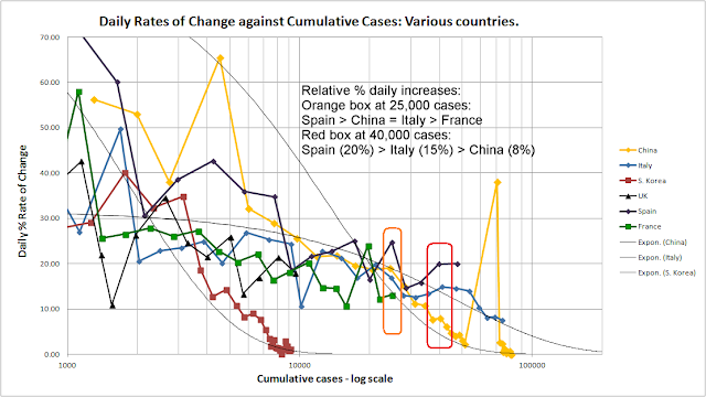
This chart indicates the relative performance of different countries under COVID-19. It shows that rate of percentage daily change in cumulative case numbers versus the actual number of cases. It really illustrates the potential trajectories of the epidemics in the different nations under this pandemic. Note the red box at 40,000 cases. The daily % increase for Spain > Italy > China. Back at 25,000 cases, Spain and Italy were both overtaking or about to overtake China's daily % increase and the rates were not falling as fast as they did in China. This was a key indictor that Italy and soon Apin exceed China. Italy already has, sadly, in terms of deaths and is right at the point of overtaking China in terms of cases and heading to the hubndreds of thousands. Spain is likely to have a similar fate, probably worse than Italy. France at 25,000 cases has a % rate of increase that is approaching China's. Again, the rate of increase daily in France is not falling at the ...


Comments
Post a Comment