Posts

Showing posts from February, 2020

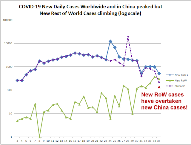
Rest of World new cases streak ahead of China to 1000 today.

Image
Since I made my last post, the Rest of World new cases of COVID-19 have streaked ahead of China to 1000 today against around 350 for China  Now there are uncertainties in the figures but we have to take them for what they are. China is on a clear path of limitation with a kind of S-curve chart of epidemic cases, whereas the rest of the world is on a clearly exponential increase of case totals and daily new cases. The daily new cases gives the rate of change. A genuine exponential curve indeed does have an exponential rate of change. That is high school maths. Of course, this kind of increase will also show a straight line upslope on a log chart and that indeed is the case.  The new chart of RoW vs China vs global new cases is here: Recent days magnified: As can clearly be seen on the overall graph for all cases, the wedge is opening up on the global line versus the china line meaning that rest of world cases have separated from the China trend to the upside and are in a diffe

20200222 Rest of world new cases overtook China new cases today! Pandemic Smoking Gun Possibility 2.

Image
Today, the daily increase in rest of world COVID-19 cases overtook China's new cases for the first time. Nothing else to say except for this. The WHO still has China as Very High risk, and Regional risk as merely High and worldwide risk as High. They are not even acknowledging a regional pandemic with South Korea's cases doubling every 48 hours or less! Here is the chart. This is comparing Worldwide daily new cases to China daily new cases (at the top and falling quite rapidly) with rest of world daily new cases (was at the bottom but now rising rapidly and overtaking China): China situation has improved significantly and rest of world has deteriorated significantly. The daily new cases in the rest of the world are on a straight line trend on a log chart - as you can see! That means exponential rise! One can see on the following chart the S-curve of China in green and the rest of the world starting to break away above it, perhaps in to another S-Curve hopefully not

Pandemic Smoking Gun Possibility: Rest of world under-performing China COVID-19 new cases.

Image
The rest of the world under-performs China with greater % increases in COVID-19 new cases. It could be that modest sized case clusters are increasing in countries outside China but are being controlled - but the evidence is pointing towards a bias in trend towards cases beginning to spread outside of China faster than inside over about the last 10 days. The following two charts show clearly that the rest of the world is dramatically underperforming the regions in China outside of Hubei (Rest of China) and also is underperforming China as a whole including Hubei where Wuhan is situated. This could be the first sign of global pandemic conditions. It's a smoking gun in a sense, in my view. It's not surprising the the WHO is saying that "the window of opportunity" for containment is closing. The charts are self explanatory. The first chart EXCLUDES cases from the Diamond Princess to highlight that the case figures endogenous to the rest of the world are deterioratin

South Korea 22 Feb 2020: Possible 1,000 COVID-19 cases in 2 days time.

Image
The following log chart shows the 2 days forecast for South Korea on the basis of exponential trend shown by straight line on this log chart projecting 1,000+ cases possible in 2 days' time. This will depend on containment efforts and their success or failure. There are 400+ cases already. Let's hope they are all quarantined and did not come into contact with any more people over the past few days:

COVID-19 Exponential breakout in South Korea in new and total cases.

Image
New charts showing exponential breakout in Novel Coronavirus (SARS CoV2 = COVID-19) cases in South Korea over the past few days. together with the picture since late January. Overall perspective in S E Asia: Soiuth Korea new (daily new) and total cases: South Korea exponential model 1 for recent days: South Korea Exponential model 2 for recent days - better fit. Log chart -0 straight line indicates exponential rise. Possible 1000 cases in 2 days' time.

COVID19 exponential breakout in Japan over a few days.

Image
COVID19 exponential breakout in Japan over a few days. There seems to have been an exponential breakout in COVID-19 cases in Japan between the dates 9 Feb to 15 Feb. This was probably one single cluster of cases but I have not researched if this is actually true. It seems from the data that I have examined that there are exponential outbreaks that get shut down by quarantining and then these turn to a kind of an S-curve. I think the entire Wuhan curve is doing this. In Japan we likely had a mini version of this. What seems to be happening in Singapore is that there have been several mini outbreaks that got closed down but the outbreaks are getting larger gradually. This leads to an uptrend in daily new cases which might be roughly linear and a roughly parabolic acceleration curve in total cases. Exponential breakout in Japan 09-15 Feb 2020: This forms part of the overall Japan total cases chart, which overall does not seem to be exponential but closer to parabolic:

COVID-19: % daily new deaths rising versus % daily new cases.

Image
COVID-19: % daily new deaths rising versus % daily new cases. This chart shows the % increase in new cases and new deaths each day from COVID-19, taken from the WHO situation reports. The day numbers on the bottom axis are the report numbers (Report 1=21 Jan 2020). I initially looked at this data to see if the two trends coupld be translated across to superimpose ne another. This would have given an idea of average time from diagnosis to death and could have perhaps been used to estimate case mortality death rates based on prior values for total cases and current deaths.. However, the two curves could not be superimposed because the % change in deaths, though downtrending against time, is trending up versus the % daily change in case numbers. Both figures are cumulative. Does this suggest that case mortality is going to be higher than currently thought?

Rest of World rate of Change is faster than in China for COVID cases.

Image
Hi All, The following chart shows that COVID19 novel coronavirus cases in the rest of the world are now rising at a faster percentage rate than in China - on four different metrics. See chart below. Four lines are represented. All have started to slope upwards. Explanation below. Purple line: Total rest of world cases vs Chinese cases as %. Started to rise mainly due to rapid increase in Diamond Princess ("International Conveyance") cases. Red line: Rest of World EXCLUDING the Diamond Princess cruise ship has just started to trend up vs the China total. However, China includes Wuhan in Hubei which has been the epicentre and has suffered the worst death rates and the worst case numbers so far. I noticed a significant difference between the rates of growth in Hubei province versus the rest of China. Hubei has risen faster than Rest of China during the whole epidemic and has taken up an ever higher percentage of Chinese cases. Therefore, I concluded that it was i

Coronavirus forecast charts COVID-19.

Image
Coronavirus forecast charts COVID-19. I have some data analysis and forecasting for the outbreak of 2009 novel Coronavirus, n-Cov, now re-named COVID-19. The charts are self explanatory, all copyright David Bellamy 2020 and may not be re-published without permission. Forecast for world cases under current conditions (see legend). This effectively amounts to world cases under the assumption that the epidemic is confined to China and principally Wuhan and Hubei Province. Forecast for world cases under current conditions (see legend). This effectively amounts to world deaths under the assumption that the epidemic is confined to China and principally Wuhan and Hubei Province. However, Daily % New Deaths are higher than daily % New Cases: Much more data and analysis to come.